The Best Paint Colors to Brighten a Dark North-Facing Room
Explore five warm paint color families for a dark north-facing room, with matching illustrations and a practical plan for testing samples at home.
By Home Crane Editors. . 5 min read.
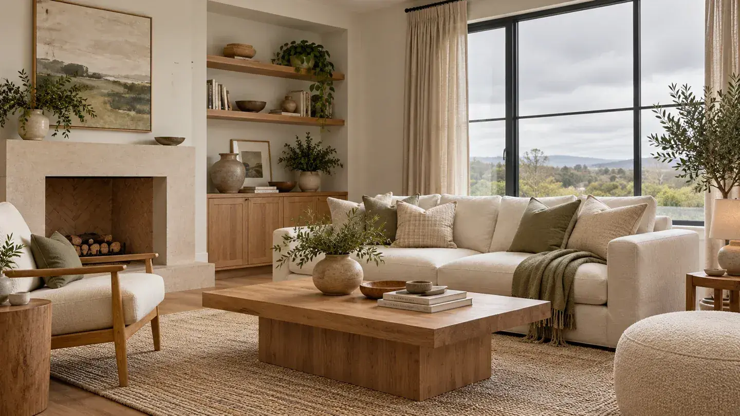
A dark north-facing room usually benefits from a light color with a little warmth: warm off-white, pale cream, light beige, muted yellow, or soft warm blush. The best choice is the one that still looks inviting beside your flooring and furniture when the room's lamps are on. A paint chip that looks cheerful in a store can feel surprisingly gray at home.
For homes in the United States, north-facing windows often receive cooler, indirect daylight. Benjamin Moore's north-facing room guidance recommends considering warm undertones and testing colors in the actual space. Window size, trees, neighboring buildings, and other windows can matter as much as compass direction.
The five families below are editorial starting points, not exact product matches or a claim that paint creates daylight. The illustrations show possible room treatments. Use real samples to choose your final color.
Before Choosing a Color, Check What Makes the Room Dark
Start with the window. Heavy curtains that cover part of the glass can reduce the light entering the room. Move furniture that blocks the opening, clean accessible glass, and look at the space with the shades fully open. You may discover that the darkest corner needs a lamp regardless of wall color.
Next, identify fixed finishes. Orange-toned oak, cool gray tile, reddish brick, and creamy trim each change how a nearby color appears. Hold samples directly beside those materials. A neutral that seems attractive alone may reveal an unwanted pink or green cast in that company.
Light reflectance value, usually called LRV, can help compare how much visible light a color reflects. It does not tell you whether the undertone will suit your room. Use the manufacturer's published value as one screening tool, then make the decision with a physical sample.
1. Warm Off-White for a Gentle Starting Point
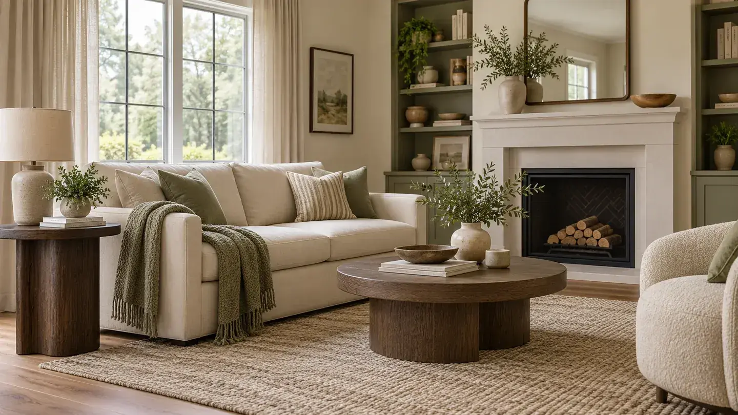
Warm off-white is a useful first sample when you want the room to feel lighter without adding obvious color. Look for a soft ivory impression rather than a stark, blue-looking white. Pair it with light upholstery and a few medium-toned pieces so the room retains definition.
Benjamin Moore includes White Dove OC-17 in its north-facing palette and Swiss Coffee OC-45 among its warm white suggestions. These are named colors to investigate, not interchangeable formulas. Buy the actual sample from the intended brand; a screen rendering cannot verify either one.
Be particularly careful beside existing white trim. A warmer wall color can make cool trim look sharper, while creamy trim may make the walls seem less warm. Test that junction before painting the entire room. For a calm result, consider coordinating the wall and trim undertones while using an appropriate trim coating.
2. Pale Cream for More Visible Warmth
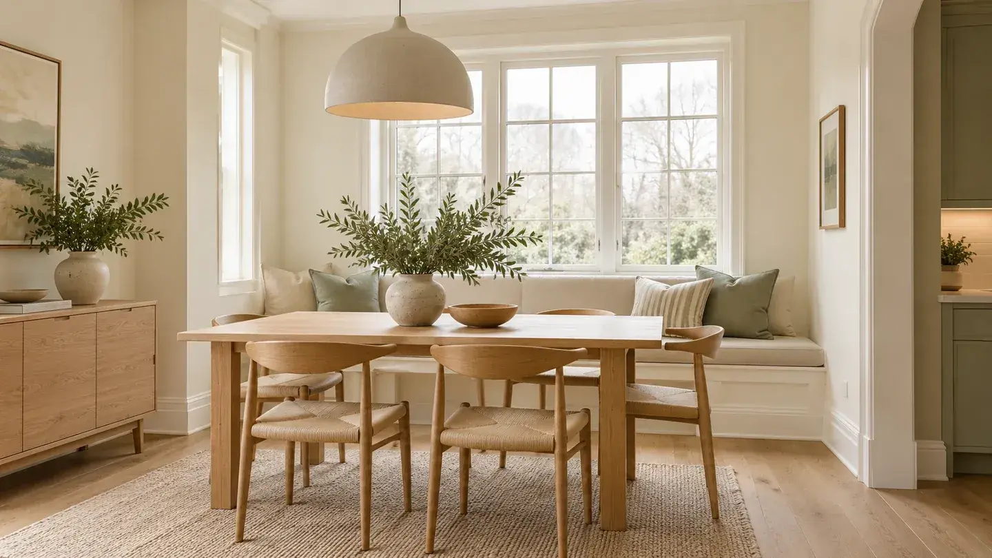
Pale cream makes sense when an off-white sample disappears into a dull gray impression. Its gentle yellow influence can bring a more welcoming appearance to a breakfast nook, sitting room, or bedroom with cool daylight.
Keep the color pale if brightness is the priority. Rich cream can become much stronger under warm evening lighting, especially alongside honey-colored floors. Before buying gallons, put a sample near the floor and another at eye level. Those locations often reveal different relationships with reflected color.
Style the room with restrained contrasts: an oak table, cream curtains, and one dark picture frame may be enough. If the entire room becomes too yellow, change the sample rather than hoping new accessories will correct it. Cream should support the existing finishes, not require replacing everything around it.
3. Light Beige for a Grounded Neutral
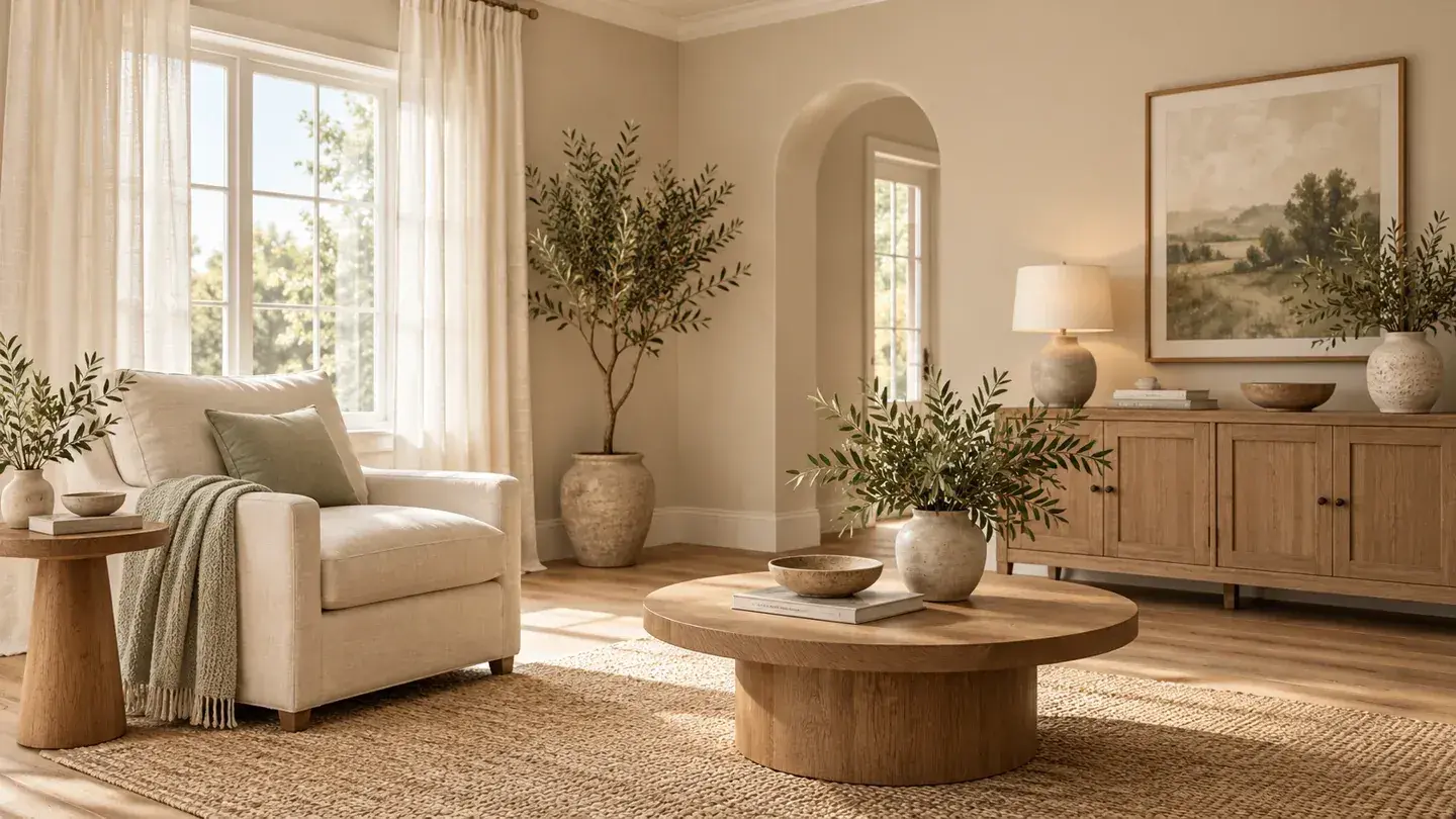
Light beige is worth sampling when you want warmth but dislike visibly creamy walls. It can sit comfortably beside woven textures, medium wood furniture, and linen-colored upholstery. Choose a pale version rather than assuming that any color labeled beige will brighten the space.
Undertones matter here. A beige that leans pink may look appealing with reddish wood but less comfortable beside a green-gray stone surface. Another beige may feel muddy when there is very little light. Compare only two or three candidates at a time so subtle differences remain visible.
A useful styling approach is to repeat the wall's warmth in one large element, such as curtains, while keeping the ceiling relatively light. Avoid filling every surface with similar midtone objects. A clear range from light to dark gives the room shape even when the palette is quiet.
4. Muted Pale Yellow for a Sunnier Impression
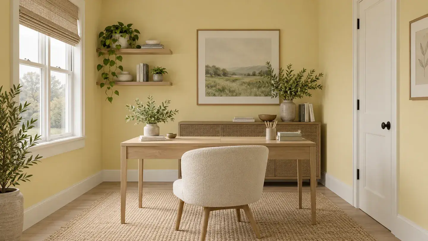
A restrained pale yellow can make a cool room feel more cheerful. Think soft butter or diluted straw rather than a saturated lemon shade. This choice works especially well when you want the wall color to be part of the room's personality.
Yellow can become more noticeable when it covers four walls. Try a large sample behind the furniture that will remain in place, then sit across the room to evaluate it. A tiny chip held at arm's length does not reproduce that effect.
For balance, use simple white or cream textiles and a limited amount of patterned decor. In a home office, compare the sample beside the desk surface and monitor area. You want a background that feels pleasant during normal use, not merely attractive for a moment while standing at the doorway.
5. Soft Warm Blush for Subtle Color
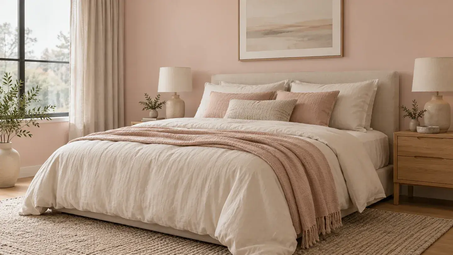
A very pale blush with a warm, peach-like influence offers an alternative to neutral walls. It can suit a bedroom, reading room, or small dining space where you want softness without a strong yellow cast.
This is a color family that deserves careful testing. A pink that looks muted in daylight may become more pronounced under a particular lamp. Place the sample beside bedding, curtains, and artwork rather than selecting it in isolation.
Keep the supporting palette deliberate. Natural wood, off-white fabric, and a small amount of muted green can make blush feel composed. If it starts to feel too sweet for your taste, choose a less saturated sample. Adding large amounts of gray decor after painting is a less reliable solution than selecting the right wall color first.
A Simple Sampling Plan
Sherwin-Williams' room-orientation guidance also treats light direction as part of color selection. Use that principle in a practical comparison:
| Feature | What to observe | |
|---|---|---|
| Near the window | Does the sample look pleasantly warm or too yellow? | |
| On the darkest wall | Does it retain color, or turn muddy? | |
| Beside permanent finishes | Are the undertones compatible? | |
| With your usual lamps on | Does the evening appearance still work? |
Use the sample product as directed and compare colors on the same type of backing. Move sample boards between locations if that is permitted by the sampling system. Keep notes rather than relying on memory.
Do not assume the glossiest wall finish will solve a lighting problem. Select sheen for the wall condition, cleaning needs, and product guidance. Reflections can draw attention to surface irregularities.
Which Color Should You Try First?
Begin with warm off-white if you want the least visible change in color. Add pale cream if the room needs more apparent warmth, or light beige if you prefer a grounded neutral. Choose pale yellow or blush when you want a deliberate decorative statement.
Buy the full quantity only after checking the sample through your normal daily routine. The right choice should work on an ordinary cloudy afternoon and a typical evening, not just during the room's best five minutes of light.
Sources
- Benjamin Moore: North Facing Room Paint Colors. Checked October 5, 2026
- Sherwin-Williams: Color by Room Orientation. Checked October 5, 2026
Share this article
Get new guides by email
Practical home articles and free resources. No spam, and you can unsubscribe at any time.
Keep reading
15 Icy Blue Bedroom Paint Ideas for 2026
Explore 15 icy blue bedroom paint ideas, from accent walls to blue ceilings, with warm pairings and practical sampling tips for 2026.
October 2026, 6 min read
Neo Deco Living Room Ideas: How to Get the Look on a Budget
Create a budget Neo Deco living room with curves, geometric patterns, metallic accents, jewel tones, and balanced furniture styling.
October 2026, 3 min read
15 Smart Small Laundry Room Stackable Washer Dryer Ideas
Explore 15 smart small laundry room stackable washer dryer ideas. Compare illustrated concepts, practical layout tips, and planning checks.
October 2026, 6 min read